Looking at Spx returns after the dear leader has spoken, last 26 instances

Notebook:
https://github.com/Darellblg/VoodooMarkets/blob/master/BlogStateoftheUnionSpeechHangover.ipynb

Looking at Spx returns after the dear leader has spoken, last 26 instances
Notebook:
https://github.com/Darellblg/VoodooMarkets/blob/master/BlogStateoftheUnionSpeechHangover.ipynb
A quick look at Spx returns if first day of month is down more than 1%

Notebook link
Thanks for your time
Spx had a rather long streak of low volatility. There is no predictive value or signal here, i just wanted to eyeball & visualize how long the low vol streak lasted and how it compared to other low vol streaks.
Here are all the Spx low vol streaks (close to close change > +/-1%) that lasted more than 42 days, since the 50’s
Notebook with code here
Thanks for your time
While seeing some “sell in may” headlines a while ago, thought i’d pull up the monthly mean returns for spx and vix. I wanted to see them on an even keel, so that each month starts at 0%, to better gauge their monthly behaviour
import pandas as pd
import numpy as np
import matplotlib.pyplot as plt
import seaborn as sns
import quandl
import calendar

%matplotlib inline
sns.set(style="whitegrid")
Since yahoo data went dark, had to pull it in manually. There is a more intelligent solution posted in Trading With Python blog
spx = pd.read_csv("../Data/Spx.csv", index_col="Date")
spx.index = pd.to_datetime(spx.index, format="%Y-%m-%d")
spx = spx.apply(pd.to_numeric, errors="coerce")

vix = pd.read_csv("../Data/Vix.csv", index_col="Date")
vix.index = pd.to_datetime(vix.index, format="%Y-%m-%d")
vix = vix.apply(pd.to_numeric, errors="coerce")
Adding dates and stuff to dataframes
def DatesAndPct(df):
 df["day"] = df.index.dayofyear
 df["month"] = df.index.month
 df["year"] = df.index.year
 df["pct"] = np.log(df["Adj Close"]).diff()
 return df

spx = DatesAndPct(spx)
vix = DatesAndPct(vix)
Making a function for plots and plotting e‘m all at once
plt.figure(figsize=(16, 9))
label_props = dict(boxstyle="square", facecolor="w", edgecolor="none", alpha=0.69)

def plotMonths(df, color, line=1, m_names=True):
 df.index = pd.to_datetime(df.index, format="%Y-%m-%d")
 df.set_index(df["day"], inplace=True, drop=True)

 for i in range(1, 13):
 month_name = calendar.month_abbr[i] # Adding month name

 data = df[df["month"] == i]
 out = data["pct"].groupby(data.index).mean()
 out.iloc[0] = 0 # Setting returns to start from zero

 # Getting coordinates for month name labels
 x = out.index[-1]+2
 y = out.cumsum().iloc[-1]-0.01

 # Plotting
 plt.plot(out.cumsum(), linewidth=line, color=color, label="_nolabel_")
 if m_names == True:
 plt.text(x, y, month_name, size=13, bbox=label_props)

plotMonths(spx, "#555555", 2, m_names=False)
plotMonths(vix, "crimson", m_names=True)

plt.title("Vix and Spx mean returns from month start (log scale)")
plt.plot([], [], label="Vix (since 1990)", color="crimson") # Adding custom legends
plt.plot([], [], label="Spx (since 1950)", color="#555555") # Adding custom legends
plt.axhline(linestyle="--", color="#555555", alpha=0.55)
plt.grid(alpha=0.21)
plt.legend(loc="upper left")
plt.xlabel("Day of year")
plt.ylabel("Log cumulative monthly return")

While im at it, since Crude and Gold also have volatility indexes available, also pulled summaries for them. Crude vs Ovx and Gold vs Gvz


Thanks for your time
Well, Its here, spot Vix close below 10. From what i read from the web, people are piling into short vol strategies on an escalating scale. I suspect unwinding of that trade will be rather brutal. I wish good luck to every short vol trader out there and dont forget to wear a helmet :)
import pandas as pd
import numpy as np
import matplotlib.pyplot as plt
import seaborn as sns
import quandl

sns.set(style="whitegrid")
%matplotlib inline

vix = quandl.get("YAHOO/INDEX_VIX", authtoken="YOUR_KEY")
vix.index = pd.to_datetime(vix.index)
vix.drop({"Open", "High", "Low", "Close", "Volume"}, inplace=True, axis=1)
vix.columns = ["close"]
vix["pct"] = np.log(vix["close"]).diff()
Lets look at all instances where Vix closed below 10 (if prev close was >= 10)
heat = vix[(vix["close"].shift(1) > 10) & (vix["close"] < 10)].transpose().iloc[:1]
heat.columns = heat.columns.map(lambda x: x.strftime("%Y-%m-%d"))

cmap = sns.dark_palette("red", as_cmap=True)

fig, ax = plt.subplots(1, figsize=(16, 9))
ax = sns.heatmap(heat, square=True, cmap=cmap, linewidths=1,
 annot=True, cbar=False, annot_kws={"size":42}, fmt="g")
ax.axes.get_yaxis().set_visible(False)
plt.title("All Vix closes < 10 since 1993 (if previous close was >= 10)")

Closes below 10 are rare
ecd = np.arange(1, len(vix)+1) / len(vix)

plt.figure(figsize=(11, 11))
plt.plot(np.sort(vix["close"]), ecd, linestyle="none", marker=".", alpha=0.55, color="#555555")
plt.axvline(10, linestyle="--", color="crimson", label="Vix below 10 threshold")
plt.grid(alpha=0.21)
plt.title("Vix daily close values Ecdf")
plt.xlabel("Vix close")
plt.ylabel("Percentage of closes that are less than corresponding closes on x")
plt.legend(loc="center right")

According to the few past instances, Vix should live’n up in the coming days
def getRets(df, days):
df = df.reset_index()
df_out = pd.DataFrame()
for index, row in df.iterrows():
if df["close"].iloc[index-1] >= 10 and df["close"].iloc[index] < 10:
ret = df["pct"].iloc[index:index+days]
#ret = np.log(ret).diff()
ret.iloc[:1] = 0
ret.reset_index(drop=True, inplace=True)
df_out[index] = ret

return df_out

vix_21rets = getRets(vix, 90+1)

plt.figure(figsize=(16, 9))
plt.plot(vix_21rets.cumsum(), color="#555555", alpha=0.34, label="_nolegend_")
plt.plot(vix_21rets.mean(axis=1).cumsum(), color="crimson", label="Mean rets")
plt.grid(alpha=0.21)
plt.title("Vix returns after closing below 10")
plt.ylabel("Vix % return")
plt.xlabel("Days after closing below 10")
plt.axhline(linestyle="--", linewidth=1, color="#333333")
plt.xticks(np.arange(0, 90+1, 5))
plt.legend(loc="upper left")

Notebook:
https://github.com/Darellblg/voodoomarkets/blob/master/BlogVixBelowLow.ipynb
Thanks your time and feel free to leave a comment
Vix homing in on a close below 10. Has’nt happened during my time as a volatility speculator
All instances of Vix closing below 10 (if previous close was >= 10):

This monday, we were witnesses to a rather large decline in Vix. Taking a quick look at how often drops like this happen and how has Vix behaved after large single day drops
import pandas as pd
import numpy as np
import matplotlib.pyplot as plt
import matplotlib.dates as mdates
import scipy as sp
import seaborn as sns
import quandl

sns.set(style="whitegrid")
%matplotlib inline

vix = quandl.get("YAHOO/INDEX_VIX", authtoken="YOUR-KEY")
vix.index = pd.to_datetime(vix.index)
vix.drop({"Open", "High", "Low", "Close", "Volume"}, inplace=True, axis=1)
vix.columns = ["close"]
vix["pct"] = vix["close"].pct_change()
There havent been that many instances of Vix gapping down more than 20%. Mondays declide has made it into the top three of the hall of shame, only topped by august 2011 and october 2008
heat = vix[vix["pct"] <= -0.2].transpose().iloc[1:]
heat.columns = heat.columns.map(lambda x: str(x)[:10])

cmap = sns.dark_palette("red", as_cmap=True)

fig, ax = plt.subplots(1, figsize=(16, 9))
ax = sns.heatmap(heat, square=True, cmap=cmap, linewidths=1,
annot=True, cbar=False, annot_kws={"size":21})
ax.axes.get_yaxis().set_visible(False)
plt.title("Hall of shame - Top 10 close to close pct declines in Vix")

20%+ declines are indeed rare while 20%+ spikes are not (comparatively speaking)
ecd = np.arange(1, len(vix)+1) / len(vix)

plt.figure(figsize=(11, 11))
plt.plot(np.sort(vix["pct"]), ecd, linestyle="none", marker=".", alpha=0.55, color="#555555")
plt.axvline(-0.26, linestyle="--", color="crimson", label="26% Decline on Monday 24’th of April 2017")
plt.grid(alpha=0.21)
plt.xlabel("Vix single day pct change")
plt.legend(loc="center right")

Not much really to look at on the scatter, since the sample size is very small on the 20%+ declines
def rets(df, shift):
out = (df.shift(-shift) / df) - 1
return out

rets_10 = rets(vix["close"], 21).where(vix["pct"] <= -0.1).dropna()
vix_10 = vix["pct"][vix["pct"] <= -0.1].iloc[:-1]
rets_20 = rets(vix["close"], 21).where(vix["pct"] <= -0.2)

slope, intercept, r_val, p_val, std_err = sp.stats.linregress(vix_10, rets_10)
rets_10_pred = intercept + slope * vix_10

plt.figure(figsize=(16, 9))
plt.plot(vix_10, rets_10_pred, linestyle="-", label="Linreg")
plt.scatter(vix_10, rets_10, color="#333333", alpha=0.55, s=21, label="Vix declines >= 10%")
plt.scatter(vix["pct"], rets_20, color="crimson", alpha=0.89, s=42, label="Vix declines >= 20%")
plt.grid(alpha=0.21)
plt.title("VIx returns 21 days after large single day declines")
plt.ylabel("Vix % return 21 days later")
plt.xlabel("Vix single day decline pct (from close to close)")
plt.axhline(linestyle="--", linewidth=1, color="#333333")
plt.xticks(np.arange(-0.3, -0.09, 0.01))
plt.legend(loc="upper left")

According to past instances, Vix should head south again after gathering itself
def getRets(df, days, pct, pct_to):
df = df.reset_index()
df_out = pd.DataFrame()
for index, row in df.iterrows():
if row["pct"] <= pct and row["pct"] > pct_to and df2["pct"].iloc[index-1] > pct:
ret = df2["close"].iloc[index:index+days]
ret = np.log(ret).diff()
ret.iloc[:1] = 0
ret.reset_index(drop=True, inplace=True)
df_out[index] = ret

return df_out

vix_21rets_10 = getRets(vix, 55, -0.1, -0.2).mean(axis=1).cumsum()
vix_21rets_20 = getRets(vix, 55, -0.2, -1).mean(axis=1).cumsum()

plt.figure(figsize=(16, 9))
plt.plot(vix_21rets_10, color="#555555", label="Vix single day declines <= 10% and > 20%")
plt.plot(vix_21rets_20, color="crimson", label="Vix single day declines > 20%")
plt.grid(alpha=0.21)
plt.title("Vix returns after large single day declines")
plt.ylabel("Vix % return")
plt.xlabel("Days from large single day decline")
plt.axhline(linestyle="--", linewidth=1, color="#333333")
plt.xticks(np.arange(0, 56, 5))
plt.legend(loc="upper right")

Thanks for your time
Almost a month has passed from the fed rate hike and just looking back at the post i did before the rate announcement, where i summarised Vix returns when rates were raised, lowered or left unchanged
History suggested Vix would rise from the announcement, and indeed it did. Now lets see if the cooloff suggested by data also holds true. Cooloff should start from day 30 to 40 from the hike

Thanks your time and feel free to leave a comment
Since today is Fed day, i thought id take a look at how rate decisions have affected Vix. Vix data starts from early 90’s so we’ll have start from there.
import quandl
import pandas as pd
import numpy as np
import matplotlib.pyplot as plt
import seaborn as sns
import datetime as dt
from pandas.tseries.offsets import *

sns.set(style="whitegrid")
%matplotlib inline

fed = pd.read_csv("fed_dates.csv", index_col="Date")
fed.index = pd.to_datetime(fed.index, format="%m/%d/%Y")
fed["Rate"] = fed["Rate"].apply(lambda x: x[:-1])

vix = quandl.get("YAHOO/INDEX_VIX", authtoken="YOUR_TOKEN_HERE")
vix["pct"] = np.log(vix["Close"]).diff()
Setting up the rate decision dates
fed_raised = fed[fed["Rate"] > fed["Rate"].shift(1)]
fed_lowered = fed[fed["Rate"] < fed["Rate"].shift(1)]
fed_unch = fed[fed["Rate"] == fed["Rate"].shift(1)]
Eyeballing all rate decisions since early 90’s along with Vix.
Clicking on the plot, summons you a bigger version.
sdate = vix.index[1] # When vix data starts

fig = plt.figure(figsize=(21, 11))

plt.plot(vix["Close"], linewidth=1, color="#555555", label="Vix (Log scale)")
plt.vlines(fed_raised.loc[sdate:].index, 8, 89, color="crimson", alpha=0.34, label="Rates raised")
plt.vlines(fed_lowered.loc[sdate:].index, 8, 89, color="forestgreen", alpha=0.34, label="Rates lowered")
plt.vlines(fed_unch.loc[sdate:].index, 8, 89, color="k", alpha=0.11, label="Rates unchanged")

plt.grid(alpha=0.21)
plt.title("Vix vs Fed funds rate decisions")
plt.margins(0.02)
plt.legend(loc="upper left", facecolor="w", framealpha=1, frameon=True)

The sample size is small, nevertheless lets look at how Vix has behaved in rate increases, decreases and when rates have unchanged
def get_rets(dates):
days_before = 10+1
days_after = 64+1
out_instances = pd.DataFrame()

for index, row in dates.iterrows():
start_date = index - BDay(days_before)
end_date = index + BDay(days_after)

out = vix["pct"].loc[start_date: end_date]
out.reset_index(inplace=True, drop=True)
out = out.fillna(0)
out_instances[index] = out

out_instances.ix[-1] = 0 # Starting from 0 pct
out_instances.sort_index(inplace=True)
out_instances.reset_index(inplace=True)
out_instances.drop("index", axis=1, inplace=True)
return out_instances

inst_raised = get_rets(fed_raised.loc[sdate:])
inst_lowered = get_rets(fed_lowered.loc[sdate:])
inst_unch = get_rets(fed_unch.loc[sdate:])

fig = plt.figure(figsize=(21, 8))

plt.plot(inst_raised.mean(axis=1).cumsum(), color="crimson", label="Rates raised")
plt.plot(inst_lowered.mean(axis=1).cumsum(), color="forestgreen", label="Rates lowered")
plt.plot(inst_unch.mean(axis=1).cumsum(), color="#555555", label="Rates unchanged")
plt.axvline(13, color="crimson", linestyle="--", alpha=1, label="Fed rate announcement date")
plt.axhline(0, color="#555555", linestyle="--", alpha=0.34, label="_no_label_")
plt.title("Vix mean returns after Fed rate decisions")
plt.ylabel("Vix cumulative pct change")
plt.xlabel("Days...")
plt.grid(alpha=0.21)
plt.legend(loc="upper left", facecolor="w", framealpha=1, frameon=True)

Thanks your time and feel free to leave a comment
Nothing quantitative here, just taking a look at how the AAII setiment has been when Spx is making new 21 week rolling highs. The recent AAII setiment has turned siginificantly negative even as Spx is plowing up and wanted to see when has that happened in the past.
import quandl
import pandas as pd
import matplotlib.pyplot as plt
import seaborn as sns

%matplotlib inline
sns.set(style="whitegrid")

aaii = quandl.get("AAII/AAII_SENTIMENT", authtoken="YOUR_KEY")
aaii.rename(columns={"S&P 500 Weekly High":"weekly_close"}, inplace=True)
weekly_max = aaii["weekly_close"].rolling(21).max()

bull_mean = (aaii["Bullish"] - aaii["Bullish"].rolling(21).mean()) / aaii["Bullish"].rolling(21).std()
bear_mean = (aaii["Bearish"] - aaii["Bearish"].rolling(21).mean()) / aaii["Bearish"].rolling(21).std()

fig, (ax1, ax2) = plt.subplots(2, 1, figsize=(16, 10), sharex=True)

ax1.set_title("AAII sentiment at Spx rolling 21 week highs")
ax1.plot(aaii["weekly_close"], color="#555555", label="_no_label_")

ax1.fill_between(aaii.index, 0, aaii["weekly_close"],
where=((bull_mean>=0) & (weekly_max == aaii["weekly_close"])),
color="forestgreen", alpha=0.34, label="Bullish sentiment dominant")
ax1.fill_between(aaii.index, 0, aaii["weekly_close"],
where=((bear_mean>=0) & (weekly_max == aaii["weekly_close"])),
color="crimson", alpha=0.96, label="Bearish sentiment dominant")
ax1.grid(alpha=0.21)
ax1.set_yscale("log")
ax1.legend(loc="upper left")

ax2.set_title("Standardized AAII setiment")
ax2.plot(bull_mean, linewidth=1, color="darkseagreen", label="Bullish")
ax2.plot(bear_mean, linewidth=1, color="crimson", label="Bearish")
ax2.grid(alpha=0.21)
ax2.legend(loc="upper left")
plt.margins(0.02)
fig.subplots_adjust(hspace=0.089)

Notebook:
https://github.com/Darellblg/voodoomarkets/blob/master/BlogAaiiSentimentAndSpxHighs.ipynb
Thanks your time and feel free to leave a comment
Spx is on a low volatility streak, taking a look at how long the streaks usually last and how the current streak relates to past instances. Also looking at Spx returns once the spell breaks – as do probably most others, i expected volatility to pick up, that does not seem to be the case. Bill Luby of Vix And More had a recent post supporting the case for low volatility feeding low volatility on a more long term basis. I myself look at a shorter timeframe but its good to keep longer timeframe in mind and not get overly carried away whenever Vix is asleep.
import pandas as pd
import numpy as np
import matplotlib.pyplot as plt
import datetime as dt

spy = get_pricing(symbols("SPY"), fields=["close_price", "high", "low"],
start_date=pd.Timestamp("2002-01-01"), end_date=dt.date.today())

spy = pd.DataFrame(spy, index=spy.index)
spy.rename(columns={"close_price" : "close"}, inplace=True)
spy.drop(["high", "low"], inplace=True, axis=1)
spy.dropna(inplace=True)

def rets(values, shift):
ret = (values.shift(-shift) / values) - 1
return ret

spy["pct"] = spy["close"].pct_change()

spy.dropna(inplace=True)
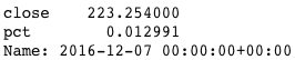
Last time Spx had a daily move of +/-1% or greater was on 7th of december
spy[abs(spy["pct"]) >= 0.01].iloc[-1]
Lets look at the previous low volatility streaks. Setting up the streak instances count and index
spy_reset = spy.copy().reset_index()
instances = []

start_index = [0]
end_index = [0]
for index, row in spy_reset.iterrows():
abs_ret = abs(row["pct"])

if abs_ret > 0.01:
start_index.append(0)

if abs_ret <= 0.01:
end_index.append(start_index[-1])

if abs_ret <= 0.01 and abs(spy_reset["pct"]).iloc[index-1] > 0.01:
start_index.append(index)

instances.append([start_index[-1], row["pct"]])

instances_df = pd.DataFrame(instances)
instances_df.columns = ["inst", "pct"]
instances_df = instances_df[instances_df["inst"] != 0]
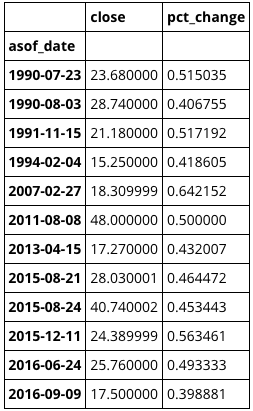
Looking at all the streak instances, where Spx daily pct moves have been below 1%, this includes moves both up and down. The current streak is nearing previous record (data starts from 2002). In absolute return terms, its rather close to the previous record and the wall of worry seems to have a consistent return angle across all long low volatility streaks
current_run = instances_df.groupby(["inst"]).get_group(3760)
current_run.loc[-1] = [0, 0]
current_run.index = current_run.index + 1
current_run = current_run.sort()
current_run.reset_index(inplace=True)

for index, group in instances_df.groupby(["inst"]):
if len(group) > 10:
group.loc[-1] = [0, 0]
group.index = group.index +1
group = group.sort()
group.reset_index(inplace=True)
plt.plot(group["pct"].cumsum(), color="#555555", alpha=0.42, linewidth=1, label="_nolegend_")

plt.plot(current_run["pct"].cumsum(), color="crimson", label="Current streak (Start, Dec 12 2016)")
plt.title("Spy low volatility streaks (+/-1%) of longer than 10 days", fontsize=11)
plt.xlabel("# Of trading days in low vol streak")
plt.ylabel("Streak return")
plt.legend(loc="center right")
plt.grid(alpha=0.21)

Now that the streaks are defined, one can look at the corresponding Spx 3 month forward returns when the spell breaks and Spx gets a move of more than 1% up or down. I included only performance fo streaks lasting longer than 21 days. I was expecting to see volatility pick up
returns_df = spy.copy().reset_index()
returns_df["streak"] = np.array(instances)[:, 0]

returns_n = pd.DataFrame(index=np.arange(0, 100))

for index_g, group in returns_df.groupby(["streak"]):
if len(group) > 21:
index_g = int(group.index[-1])
out = returns_df.iloc[index_g:index_g+64]
out = out.reset_index(drop=True)
#plt.plot(out["pct"].cumsum())
returns_n[index_g] = out["pct"].cumsum()

returns_n.loc[-1, returns_n.columns.values] = 0
returns_n.sort_index(inplace=True)
returns_n.reset_index(drop=True, inplace=True)
returns_n.dropna(how="all", inplace=True)

plt.plot(returns_n, color="#555555", alpha=0.42, linewidth=1, label="_nolegend_")
plt.plot(returns_n.mean(axis=1), color="crimson", label="Mean rets")
plt.title("Spy returns after a break of low volatility streak (+/-1%) of longer than 21 days", fontsize=11)
plt.yticks(np.arange(-0.15, 0.10, 0.02))
plt.xlim(0, 63)
plt.xlabel("# Of trading days after low vol streak ends")
plt.ylabel("Post streak return")
plt.legend(loc="upper left")
plt.grid(alpha=0.21)

Thanks your time and feel free to leave a comment
As of yesterday (25’th january 2017) Vix Term Structure (1mo/3mo implied vol) closed at 0.794. Taking a quick look at what low Vix Ts values have meant for Vix returns going forward and run a bare bones backtest to gauge the initial validity of low Ts as a signal
import pandas as pd
import numpy as np
import matplotlib.pyplot as plt
from quantopian.interactive.data.quandl import cboe_vix, cboe_vxv
from odo import odo
import datetime
import pyfolio as pf

xiv = get_pricing(symbols("XIV"), fields="close_price",
    start_date=datetime.date(2011,1,1),
    end_date=datetime.date(2017,1,25))

dfvix = odo(cboe_vix, pd.DataFrame)
dfvix = dfvix.set_index(dfvix["asof_date"])
dfvxv = odo(cboe_vxv, pd.DataFrame)
dfvxv = dfvxv.set_index(dfvxv["asof_date"])

df = pd.concat([dfvix, dfvxv], axis=1, join_axes=[dfvix.index])
df.sort(inplace=True)
df = df.rename(columns={"close":"vxv_close"})
df = df[["vix_close", "vxv_close"]]
df["vix_ts"] = df["vix_close"] / df["vxv_close"]
First looking at just the overall distribution of absolute Vix Ts values, readings below .8 are rare. Data starts from 2008
ecd = np.arange(1, len(df)+1, dtype=float) / len(df)

plt.figure(figsize=(10, 10))
plt.plot(np.sort(df["vix_ts"]), ecd, linewidth=1, color="#555555")
plt.axvline(0.794, linestyle="--", color="crimson", linewidth=1)
plt.xlabel("Vix Ts values")
plt.ylabel("Percent of Vix Ts values that are smaller than corresponding x")
plt.grid(alpha=0.21)

Rather than using an absolute Vix Ts threshold as a signal or gauge to determine how low is low, i tried to use a rolling min value, meaning making the Vix Ts value relative. The threshold is simply defined as Ts – Rolling21 Min of Ts. Took two months as the trail amount, since it seems a significant enough time for Ts to make new lows
df["min_ratio"] = df["vix_ts"] - df["vix_ts"].rolling(42).min()
df.dropna(inplace=True)

def formatPlot(x, where):
    x.grid(alpha=0.21)
    x.legend(loc=where)

fig, (ax1, ax2) = plt.subplots(2, sharex=True, figsize=(16, 10))
ax1.plot(df["vix_close"], label="Vix", linewidth=1, color="#555555")
mins = df.index[df["min_ratio"] == 0]
ax1.vlines(mins, ymin=df["vix_close"].min(), ymax=90, color="crimson",
 linewidth=0.55, alpha=0.55, label="VixTs hits rolling 2 month min")

formatPlot(ax1, "center left")

ax2.plot(df["min_ratio"], color="#555555", linewidth=1, label="VixTs - rolling 2 month min")
formatPlot(ax2, "center left")

Now that the threshold is defined, one can look at the Vix returns going forward from the 2 month low being hit. Added two projected periods of 21 and 10 days to see if theres any significant difference. Average Vix returns going forward from Vix Ts hitting new 2 month lows are positive only enough so on occasions where Vix Ts itself is below 0.8 when hitting a new 2 month low
def retsShift(values, amount):
ret = (values.shift(-amount) / values) -1
return ret

df["ret21"] = retsShift(df["vix_close"], 21)
df["ret10"] = retsShift(df["vix_close"], 10)
df2 = df.copy() # Making a copy, otherwise masking will go crazy, probably doing masking wrong?
df2 = df2[df2["min_ratio"] == 0]

slope, intercept, r_val, p_val, std_err = scipy.stats.linregress(
np.array(df2["vix_ts"]), np.array(df2["ret21"]))
predict = intercept + slope * df2["vix_ts"]

plt.figure(figsize=(10, 10))
plt.plot(df2["vix_ts"], predict, "-", label="r2 = {}".format(format(r_val**2, ".2f")))
plt.scatter(df2["vix_ts"].where(df2["vix_ts"]<=0.8), df2["ret21"].where(df2["vix_ts"]<=0.8),
c="crimson", linewidth=0, s=28, alpha=0.89, label="Vix return 21 days later")
plt.scatter(df2["vix_ts"].where(df2["vix_ts"]<=0.8), df2["ret10"].where(df2["vix_ts"]<=0.8),
c="royalblue", linewidth=0, s=28, alpha=0.89, label="Vix return 10 days later")
plt.scatter(df2["vix_ts"].where(df2["vix_ts"]>0.8), df2["ret21"].where(df2["vix_ts"]>0.8),
c="#666666", linewidth=0, alpha=0.89, label=None)

plt.axhline(0, linestyle="--", color="#666666", linewidth=1)
plt.axvline(0.794, linestyle="--", color="crimson", linewidth=1, label="Vix Ts as of 25 Jan 2017")
plt.legend(loc="upper right")
plt.xlabel("Vix Ts level at which it hits a new 2 month low")
plt.ylabel("Vix return N days later")
plt.yticks(np.arange(-0.5, 1.5, 0.25))
formatPlot(plt, "upper right")

Next, looking at Vix behaviour, while filtering out only instances where Ts was below 0.8 when hitting its 2 month low. Which is what we have in Vix Ts as of this writing
But also added mean of all instances where Ts was above 0.8
for index, row in df3.iterrows():
if row["min_ratio"] == 0 and row["vix_ts"] <= 0.8:
ret = df3["vix_close"].iloc[index:index+22]
ret = np.log(ret).diff().fillna(0)
ret = pd.Series(ret).reset_index(drop=True)
df_instances[index] = ret.cumsum()

for index, row in df3.iterrows():
if row["min_ratio"] == 0 and row["vix_ts"] > 0.8:
ret = df3["vix_close"].iloc[index:index+22]
ret = np.log(ret).diff().fillna(0)
ret = pd.Series(ret).reset_index(drop=True)
df_instances2[index] = ret.cumsum()

plt.plot(df_instances, color="#333333", alpha=0.05, linewidth=1, label=None)
plt.plot(df_instances2, color="#333333", alpha=0.05, linewidth=1, label=None)
plt.plot(df_instances.mean(axis=1), color="crimson", label="Mean Vix returns where Ts <= 0.8")
plt.plot(df_instances2.mean(axis=1), color="royalblue", label="Mean Vix returns where Ts > 0.8")
plt.axhline(0, linewidth=1, linestyle="--", color="#333333")
plt.xlabel("# Of days from Vix Ts rolling 2 month low")
plt.ylabel("Vix % return")
plt.xticks(np.arange(0, 22, 1))
plt.ylim(-0.2, 0.4)
plt.xlim(0, 21)
formatPlot(plt, "upper right")

However, since one can not directly trade Vix, the results are spurious, meaning when applying the signal to buy Vxx when Vix Ts hits a new 2 month low and holding it for N days (21 in the case below), the results are horrible. The reason being that Vxx (or any long volatility etf) experiences siginificant decay when Vix futures are in contango (which is most of the time in a bull market), so that holding it (just it alone) is not viable in any way. It can be useful however as a hedge in a more reasonable position sizing and allocation context
Just to make the contango effect on Vxx plain, also added backtest version which does the opposite, meaning it goes into Xiv when Vix Ts is hitting new 2 month lows and holds for 21 days
However adding the Xiv version illustrates the Vix futures contango benefits on Xiv (at least while the underlying trend in Spx is up). The backtest’s are no way anything viable, i just added them in order to gauge validity of the raw signal itself.
One could run an optimizer in order to determine the best possible Ts min trailing threshold, but i wont do that. In my limited experience, if a signal is not immediatley evident, it wont help massaging it to fit the curve
bt_vxx = get_backtest("588a07ff3d6aed61f57ca491").daily_performance.returns
bt_vxx_rets = pf.timeseries.cum_returns(bt_vxx, starting_value=1.0)

bt_xiv = get_backtest("588a069f66ba2e6145ca1aca").daily_performance.returns
bt_xiv_rets = pf.timeseries.cum_returns(bt_xiv, starting_value=1.0)

plt.figure(figsize=(16, 8))
plt.plot(bt_vxx_rets, color="royalblue", label="Strategy trading Vxx")
plt.plot(bt_xiv_rets, color="crimson", label="Strategy trading Xiv")
plt.plot((xiv.pct_change().cumsum()+1), label="Xiv b&h", color="#555555")
formatPlot(plt, "center left")

I will look further into the underlying signal though, with a more reasonable position sizing and trade logic and will post a follow up once im somewhere with it
If anyone can pitch in regarding any mistakes, misconceptions or any other comments, please do – Thanks for your time
Scaling out of Vix short (via long Xiv) position that i have held since election day
Also starting to scale out of Tesla long that i acquired below 200, however will just reduce position and looking to add again once it takes a breather
Have smaller open positions in
Short miners
Short biotech
Recent closed positions
Short natgas
Taking a look at Vix single day spikes, since there have been two rather significant and rare single day spikes of 39 and 49% in 2016. Note, im not talking about Vix daily swings, but single day spikes from close to close. The intention here is to gauge how Vix has historically behaved after significant single day spikes
First, importing modules, vix data etc. Im running this on Quantopian so importing data is straightforward
from quantopian.interactive.data.quandl import yahoo_index_vix
from odo import odo
import pandas as pd
import numpy as np
import matplotlib.pyplot as plt
import seaborn as sns
import statsmodels.api as sm
import scipy as sp
Setting up and cleaning the vix dataframe that came from quandl and adding the single day % change values
data = odo(yahoo_index_vix, pd.DataFrame)
data = data.drop(["open_", "high", "low", "adjusted_close", "volume", "timestamp"], axis = 1)
data["close"].loc[18] = 14.04 #Fixing error data
data = data.set_index(["asof_date"])

data["pct_change"] = data["close"].pct_change()
data = data.dropna()
This years second biggest spike was 39%. There have been only 12 single day spikes of 39% or greater since 1990 (again, from close to close)
len(data[data["pct_change"] > 0.39])
12
When they occurred and what their actual spike percentages were
data[data["pct_change"] > 0.39].sort()
First, looking at all Vix daily percent changes as an empirical cumulative distribution, so one gets better idea how the daily percent changes are distributed. In this post, we are interested in the positive daily percent changes. As one can observe, spikes above 20% are rather rare
ecd = np.arange(1, len(data)+1, dtype=float) / len(data)
ticks = np.arange(-0.3, 1.1, 0.1)

plt.plot(np.sort(data["pct_change"]), ecd)
plt.xlabel("Vix daily percent changes (from close to close)")
plt.ylabel("Fraction of daily pct changes that are smaller than corresponding x")
plt.axvline(linestyle="--", color="#333333", linewidth=1)
plt.xticks(ticks)
plt.yticks(ticks)
plt.grid(alpha=0.21)
plt.margins(0.05)

We can now plot the returns N days later from a spike, iterations are for 10% and 20% spike returns 5 days later in order to have a large enough sample set. I wanted to see weither or not the spike % was correlated to the forward returns, it seems to be the case. The larger the single day spike, the more likely a negative Vix return down the road. Though it must be noted that the sample set for spikes larger than 20% is low
def pct_ret(close, amount):
rets = (close.shift(-amount) / close) - 1
return rets

ret10 = pct_ret(data["close"], 5).where(data["pct_change"] > 0.1).dropna()
pct10 = data["pct_change"][data["pct_change"] > 0.1]

ret20 = pct_ret(data["close"], 5).where(data["pct_change"] > 0.2).dropna()
pct20 = data["pct_change"][data["pct_change"] > 0.2]


slope, intercept, r_val, p_val, std_err = sp.stats.linregress(pct10, ret10)
ret10_predict = intercept + slope * pct10


plt.plot(pct10, ret10_predict, "-", label="Linreg")
plt.scatter(data["pct_change"][data["pct_change"]>0.1], ret10,
color="#333333", alpha=0.55, label="Vix spike >= 10%, return 5 days later")
plt.scatter(data["pct_change"][data["pct_change"]>0.2], ret20,
color="crimson", s=34, label="Vix spike >= 20%, return 5 days later")

plt.ylabel("Vix % return 5 days later")
plt.xlabel("Vix single day spike % (from close to close)")
plt.axhline(linestyle="--", linewidth=1, color="#333333")
plt.legend(loc="upper right")
plt.ylim(-0.5, 1)
plt.grid(alpha=0.21)
plt.title("R2={}".format(r_val**2))

For example, mean Vix return after a 20% single day spike or greater, 5 days later is about -16%
np.mean(ret_20[ret_20 < 0])
-0.16629674607687678
For a clearer picture on how Vix actually looks like after significant spikes, we can also plot the N day returns of all instances where a significant spike occurred (in the chart below, its 64 trading days). There are notable rebound tendencies at the 10th, 20-23rd and 40th trading days after a spike. The higher spike means are more pronounced since the sample size is rather smaller on those instances
data2 = data.copy().reset_index()

def rets(df, days, pct, pct_to):
ret_df = pd.DataFrame()
for index, row in df.iterrows():
if row["pct_change"] > pct and row["pct_change"] < pct_to and df["pct_change"].iloc[index-1] < pct:
ret = df["close"].iloc[index:index+days]
ret = np.log(ret).diff().fillna(0)
ret = pd.Series(ret).reset_index(drop=True)
ret_df[index] = ret
return ret_df

twenty = rets(data2, 65, 0.2, 0.3).mean(axis=1).cumsum()
thirty = rets(data2, 65, 0.3, 0.4).mean(axis=1).cumsum()
forty = rets(data2, 65, 0.4, 1).mean(axis=1).cumsum()

plt.plot(twenty, color="royalblue", label="Vix mean return after a spike > 20% and < 30%")
plt.plot(thirty, color="crimson", label="Vix mean return after a spike > 30% and < 40%")
plt.plot(forty, color="cadetblue", label="Vix mean return after a spike of > 40%")

plt.xlabel("# Of days from spike")
plt.ylabel("Vix % return")
plt.grid(alpha=0.21)
plt.ylim(-0.3, 0.1)
plt.xlim(0, 64)
plt.legend(loc="upper right")

The mean returns chart is desceptive, since there are of course plenty of instances where Vix just keeps going up, so one can get a better picture by looking at all the instances. In the case below, i plotted all spike instances of 20% or greater, 64 days forward
plt.plot(rets(data2, 65, 0.2, 1).cumsum(axis=0), linewidth=1, alpha=0.21, color="#333333")
plt.plot(forty, color="crimson", label="Mean")

plt.title("All instances of Vix singe day spikes > 20%, returns 64 days forward")
plt.xlabel("# Of days from spike")
plt.ylabel("Vix % return")
plt.grid(alpha=0.21)
plt.axhline(0, linewidth=1, linestyle="--", color="#333333")
plt.xlim(0, 64)
plt.legend(loc="upper right")

One additional way of looking at the dataset is to make a heatmap of all single day spike instances, meaning we plot out all Vix single day spikes and their mean returns, regardless of the size of the spike or the direction of the spike. First converted the pct changes to integers and then grouped all the data by those. From that a heatmap of mean returns for all Vix spike % instances can be summoned
Nothing meaningful happens in the middle of the % change range, but the edges are more pronounced, however again its worth noting that the sample size on the edges is also smaller
df3 = data.copy()

for i in range(1, 35):
df3[str(i)] = pct_ret(data3["close"], i)

df3["pct_change"] = df3["pct_change"].apply(lambda x: int(round(x*100)))
df3.reset_index(inplace=True)
df3.drop(["asof_date","close"], axis=1, inplace=True)

grouped = df3.loc["1":].groupby(df3["pct_change"], as_index=True, squeeze=True).mean()
grouped.drop("pct_change", axis=1, inplace=True)

plt.figure(figsize=(16, 13))
sns.heatmap(grouped, annot=False, cmap="RdBu")
plt.ylabel("Vix single day spike %")
plt.xlabel("Number of days after spike")
plt.title("Vix single day % spikes vs. mean returns N days later")

If anyone can pitch in regarding any mistakes, misconceptions or any other comments, please do – Thanks for your time
A potential sell setup is forming, ideal case would be a spike up after the results are in, that would set up a momentum sell

A quick look at annual returns over the 100+ years of daily percent change (close to close) data that we have on dow jones
import matplotlib.pyplot as plt
import pandas as pd
import numpy as np
import datetime

dj = local_csv("DjiaHist.csv", date_column = "Date", use_date_column_as_index = True)
dia = get_pricing("DIA", start_date = "2016-01-01", end_date = datetime.date.today(), frequency = "daily")
First cleaning up the data, especially the dates. Also adding day of the year into the df in order to sort all returns based on the day of the year and plot em all at once later
dj.sort_index(ascending=True, inplace=True)
dj.index = pd.to_datetime(dj.index)
dj.rename(columns={"Value" : "value"}, inplace=True)
dj["pct"] = np.log(dj["value"]).diff()
dj["year"] = dj.index.year
dj["day"] = dj.index.dayofyear

dia["day"] = dia.index.dayofyear
dia["pct"] = np.log(dia["price"]).diff()
dia = dia.drop(["open_price", "high", "low", "volume", "close_price"], axis=1)
dia.set_index(dia["day"], inplace = True)
dia.fillna(0, inplace=True)
Pivoting the returns table, so that we get returs for all years and all days of the year in separate columns
daily_rets = pd.pivot_table(dj, index=["day"], columns=["year"], values=["pct"])
daily_rets.convert_objects(convert_numeric = True)
daily_rets.fillna(0, inplace = True)
daily_rets.columns = daily_rets.columns.droplevel()
daily_rets.drop(2016, axis =1, inplace = True)
daily_rets.rename(columns = lambda x: str(x), inplace=True)

daily_rets.head(8)

Heres how it looks with all years plotted along with 2016
f, ax = plt.subplots(figsize=(18, 12))
ax.plot(daily_rets.cumsum(), color="#333333", linewidth=1, alpha=0.1, label=None)
ax.plot(dia["pct"].cumsum(), linewidth=2, color="crimson", label="2016 returns")
plt.grid(False)
plt.ylabel("Annual return")
plt.xlabel("Day of the year")
plt.ylim(-0.7, 0.7)
plt.xlim(0, 365)
plt.axhline(0, linewidth= 1, color="#333333", linestyle="--")
plt.legend(loc="upper left")

Adding the mean returns of all years so one can compare with 2016.
Also added a daily returns histogram so the historical day to day fluctuatios are more clear and positive or negative periods are painted out clearly
daily_rets["mean"] = daily_rets.mean(axis=1)
daily_rets["2016"] = dia["pct"]

plt.figure(figsize=(18, 12))

ax1 = plt.subplot2grid((4,1), (0,0), rowspan=3)
ax1.plot(daily_rets.index, daily_rets.cumsum(), color="#333333", linewidth=1, alpha=0.06, label=None)
ax1.plot(daily_rets["mean"].cumsum(), color="#333333", linewidth=2, alpha=0.8, label="Mean returns since 1896")
ax1.plot(daily_rets["2016"].dropna().cumsum(), linewidth=2, color="crimson", label ="2016 returns")
plt.title("Cumulative 2016 Returns Vs Mean Historical Returns Since 1896")
plt.axhline(0, linewidth= 1, color="#333333", linestyle="--")
plt.ylim(-0.15, 0.15)
plt.grid(False)
plt.legend(loc="upper left")

ax2 = plt.subplot2grid((4,1), (3,0), rowspan=3, sharex=ax1)
ax2.fill_between(daily_rets.index, 0, daily_rets["mean"], where= daily_rets["mean"]<0, color="crimson")
ax2.fill_between(daily_rets.index, daily_rets["mean"], 0, where= daily_rets["mean"]>0, color="forestgreen")
plt.title("Mean Daily Returns")
ax2.grid(False)
plt.xlim(1, 365)

Now that the show is over, its time to look at returns around elections. Up to 1936 the votes were cast in early january, from there on the vote has been in early november, so i used returns from 1936 onward in the calc. Also plotted the mean return of post-election year
daily_rets["el_year"] = daily_rets.loc[:, "1936"::4].mean(axis=1)
daily_rets["post_el"] = daily_rets.loc[:, "1937"::4].mean(axis=1)

f, ax = plt.subplots(figsize=(18, 12))

ax.plot(daily_rets.index, daily_rets.cumsum(), color="#333333", linewidth=1, alpha=0.06, label=None)
ax.plot(daily_rets["mean"].cumsum(), color="#333333", linewidth=2, alpha=0.8, label="Mean returns since 1896")
ax.plot(daily_rets["el_year"].cumsum(), color="darksage", linewidth=2, alpha=0.8, label="Election year mean returns since 1936")
ax.plot(daily_rets["post_el"].cumsum(), color="steelblue", linewidth=2, alpha=0.8, label="Post election year mean returns since 1936")
ax.plot(rets_df["pct"].dropna().cumsum(), linewidth=2, color="crimson", label ="2016 returns")
plt.grid(False)
plt.ylabel("Annual return")
plt.xlabel("Day of the year")
plt.ylim(-0.15, 0.15)
plt.xlim(1, 365)
plt.axhline(0, linewidth= 1, color="#333333", linestyle="--")
plt.legend(loc="upper left")

We can also pull up decade returns. 80’s and 90’s were good times indeed. Applied a 21 day mean to the returns to the trends would be more clear
def decadeMean(start, end):
return daily_rets.loc[:, start : end].cumsum().mean(axis=1)

decade_rets = pd.DataFrame({#"1900’s" : decadeMean("1900", "1909"),
#"1910’s" : decadeMean("1910", "1919"),
#"1920’s" : decadeMean("1920", "1929"),
#"1930’s" : decadeMean("1930", "1939"),
#"1940’s" : decadeMean("1940", "1949"),
#"1950’s" : decadeMean("1950", "1959"),
#"1960’s" : decadeMean("1960", "1969"),
"1970’s" : decadeMean("1970", "1979"),
"1980’s" : decadeMean("1980", "1989"),
"1990’s" : decadeMean("1990", "1999"),
"2000’s" : decadeMean("2000", "2009"),
"2010’s" : decadeMean("2010", "2015")
}, index= daily_rets.index)

mean_rets = decade_rets.rolling(21).mean()

plt.figure(figsize=(18, 12))
mean_rets.plot(linewidth=1)
rets_df["pct"].dropna().cumsum().rolling(21).mean().plot(color="crimson", linewidth=2, label="2016")
plt.legend(loc="upper left")
plt.ylabel("Annual return")
plt.xlabel("Day of the year")
plt.grid(False)

The most revealing thing about this to me, is that the day to day fluctuations havent really changed over 100+ years – market still behaves the same.
For example, if we randomly reshuffle the order of daily returns of 1910 and compare it to 2015 reshuffled daily returns, its impossible to say which one is which. The nature and behaviour of day to day fluctuations is still the same.

If anyone can pitch in regarding any mistakes, misconceptions or any other comments, please do – Thanks for your time
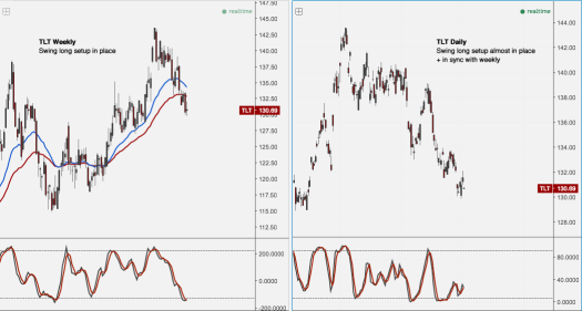
TLT‘s weekly and daily momentums are in sync and have formed a buy setup. Daily might need a bit more downside or time to form.
What i think is happening is that the Brexit vote is fresh on speculators minds, the polls were dead even before the vote but few actually believed the exits would win. Perhaps we are seeing something similar with us elections right now, meaning (almost) all predictions and polls point to Clinton (Stay), but a surprise like Trump (Exit) weighs on peoples minds.
Here are some of the good research and analysis done
FiveThirtyEight Elections
NY Times 2016 Election
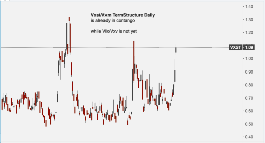
Vxst/Vxm TermStructure Daily is already in contango
while Vix/Vxv is not yet
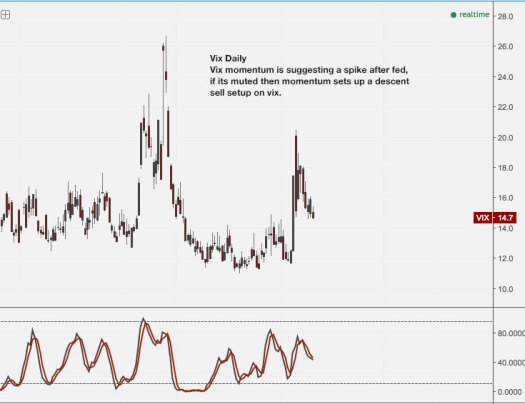
Vix momentum is suggesting a spike after fed, if its muted then momentum sets up a descent sell setup on vix.
Vix term structure readings of below 0.8 are rare and are usually followed by an increase in volatility

